Aug 2, 2022
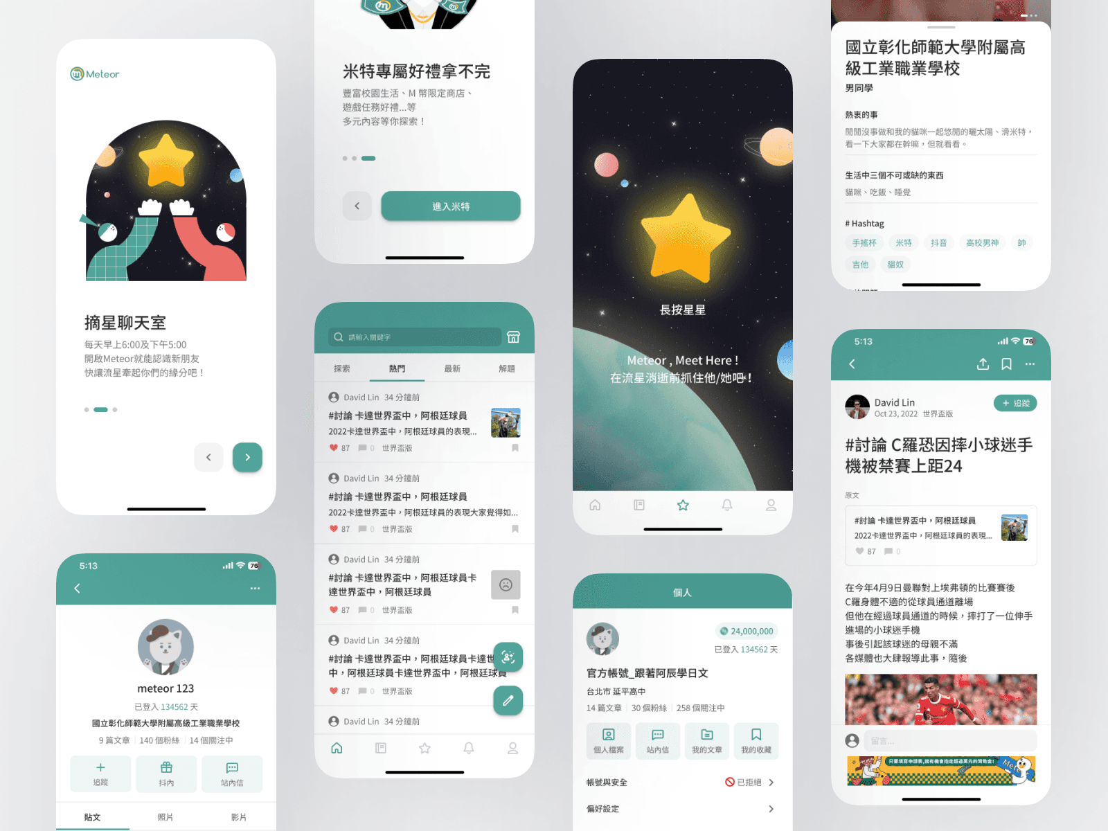
Meteor|Student Community App
Taiwan's anonymous community for junior high and high school students to talk about school, relationships, and daily life.
B2C
Redesign
App (iOS + Android)
Design System
Role
Lead Product Designer
team
1 PO, 1 PM, 2 Product Designers, 5 Engineers ( iOS, Data )
platform
App (iOS + Android)
Timeline
7 months (ongoing iteration)

BACKGROUND
Meteor had no design system — and no Figma file at all: screens were pieced together by engineers. Colors, components, and interaction patterns varied page by page, and the overall UI/UX quality was low: the visual language was fragmented, users had to guess how things worked, and core flows like commenting and friend matching even had clear dead ends. The redesign started there: build design standards from zero, and rebuild these basic experiences.
MY ROLE
Led the redesign of 14 feature areas on iOS and Android, reworking user flows and information architecture
Made design decisions through a weekly feedback loop — user chat group, interviews, field observation
Built Meteor's design system — colors, typography, grids, and Figma components — reused for every new feature after launch
RESULT
The rebuild paid off both ways: key actions got easier for users, and the team stopped rebuilding the same parts. The NPS lift came from weekly iterations, not one big release — it reflects the whole product's progress, with the system as the base it was built on.
Even the brand color differed from screen to screen. Before designing anything new, the standard itself had to be built.
Building the new UI while untangling the old flows — and every fix on one side moved something on the other.
439K downloads and users in the app every day. The transition couldn't leave anyone with a broken step.
14 feature areas across iOS and Android — every decision had to repeat cleanly on all of them.
SOLUTION
Fixing the outside — the design system
Archaeology came first — redrawing existing screens from screenshots just to have a starting point — then color, type, and grid, with every control becoming a Figma component.
Fixing the inside — the user flows
The broken flows were found through evidence: user research and internal cognitive walkthroughs surfaced the steps that made no sense, and we reviewed each one through a product designer's lens.
How we shipped it
Priority came from users: flow fixes tied to reported bugs and complaints shipped first, release by release. The design system took the opposite path — held back until everything was unified, then switched over in one release, so users only felt things getting better, not half-changed.
IMPACT
The rebuild paid off both ways: key actions got easier for users, and the team stopped rebuilding the same parts. The NPS lift came from weekly iterations, not one big release — it reflects the whole product's progress, with the system as the base it was built on.