Jul, 2023
Meteor|Student Community App
Taiwan's anonymous community for junior high and high school students to talk about school, relationships, and daily life.
B2C
Redesign
App (iOS + Android)
Design System
Role
Lead Product Designer
team
1 PO, 1 PM, 2 Product Designers, 5 Engineers ( iOS, Data )
platform
App (iOS + Android)
Timeline
7 months (ongoing iteration)

BACKGROUND
Meteor had no design system — and no Figma file at all: screens were pieced together by engineers. Colors, components, and interaction patterns varied page by page, and the overall UI/UX quality was low: the visual language was fragmented, users had to guess how things worked, and core flows like commenting and friend matching even had clear dead ends. The redesign started there: build design standards from zero, and rebuild these basic experiences.
GOAL
Scale Product Infrastructure:
Build a unified design system from zero — cutting development cost and speeding up every future release.Remove Experience Friction:
Redesign broken user flows across 14 feature areas to lift retention and user sentiment (NPS 48 at the start).Seamless Transition:
Migrate 439K+ users to the new experience through systematic, incremental releases — without breaking daily habits.
MY ROLE
Led the redesign of 14 feature areas on iOS and Android, reworking user flows and information architecture
Made design decisions through a weekly feedback loop — user chat group, interviews, field observation
Built the design system — colors, typography, grids, and Figma components — reused for every new feature after launch
RESULT
The rebuild paid off both ways: key actions got easier for users, and the team stopped rebuilding the same parts. The NPS lift came from weekly iterations, not one big release — it reflects the whole product's progress, with the system as the base it was built on.
Even the brand color differed from screen to screen. Before designing anything new, the standard itself had to be built.
Building the new UI while untangling the old flows — and every fix on one side moved something on the other.
439K downloads and users in the app every day. The transition couldn't leave anyone with a broken step.
14 feature areas across iOS and Android — every decision had to repeat cleanly on all of them.
SOLUTION
Fixing the outside — the design system
Archaeology came first — redrawing existing screens from screenshots just to have a starting point — then color, type, and grid, with every control becoming a Figma component.
Fixing the inside — the user flows
The broken flows were found through evidence: user research and internal cognitive walkthroughs surfaced the steps that made no sense, and we reviewed each one through a product designer's lens.
How we shipped it
Priority came from users: flow fixes tied to reported bugs and complaints shipped first, release by release. The design system took the opposite path — held back until everything was unified, then switched over in one release, so users only felt things getting better, not half-changed.
DESIGN PROCESS
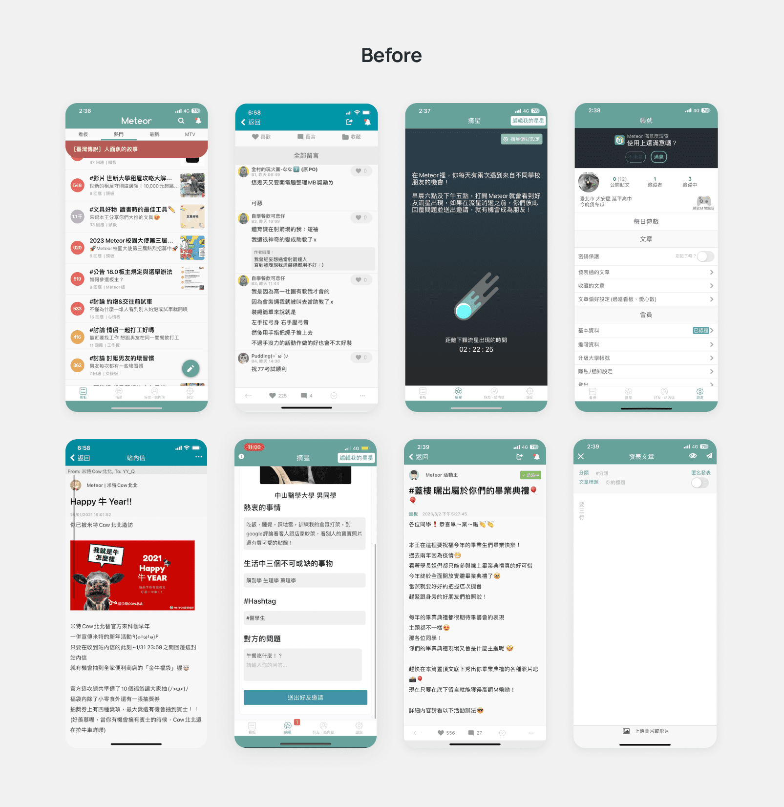
1. No design system
Colors, components, and tag styles vary page by page — at least three visual languages coexist in one app.
2. Interaction affordance left to guesswork
Icon-only actions with no labels, unclear tap targets, and contradictory state semantics (e.g., tappable buttons styled as disabled).
3. Broken information hierarchy
Overloaded list rows, form labels indistinguishable from answers, and long-form content and in-app mail with no typographic treatment.
4. Rough visual & copy details
FAB covering the last list row, low-contrast placeholders, typos, and ambiguous helper text.
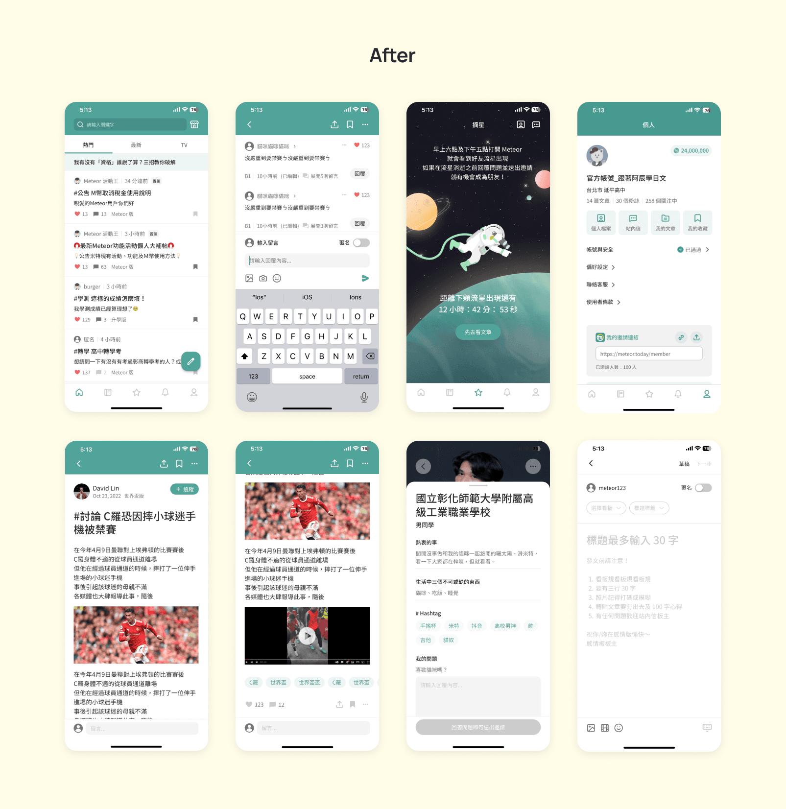
1. A unified design system
Rebuilt the visual foundation — color, type, grid, and a full component library — so every screen draws from one shared language instead of improvised styles. Intentional theme variations remain, but as design decisions within the system, not fragmentation.
2. Explicit interaction affordance
Every action now declares itself: inputs are visible where users expect them, controls are labeled, states mean what they show, and CTAs state their consequences. Interaction no longer relies on guesswork or convention.
3. Rebuilt information hierarchy
Established consistent scanning patterns across all content surfaces — lists, articles, forms, and profiles each follow a defined structure, so users always know where to look and what each element means.
4. Details & guidance filled in
Dead ends gained next steps, empty states became guidance, and layout collisions were resolved — the long tail of paper cuts addressed systematically rather than case by case.
IMPACT
The rebuild paid off both ways: key actions got easier for users, and the team stopped rebuilding the same parts. The NPS lift came from weekly iterations, not one big release — it reflects the whole product's progress, with the system as the base it was built on.
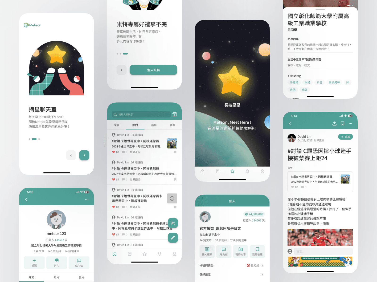
TAKEAWAY 🧠
Design debt is way too expensive to pay back.
Rebuilding this system from scratch was super exhausting. We spent almost all our time doing the heavy lifting just to fix the basics, which left very little energy for anything else. It was a huge lesson in why good groundwork matters from day one.